
Editorial Archive: Good Housekeeping
Paul Pensom on interesting and notable editorial design.
As an occasional DJ and record buyer of many years’ standing, I’ve long been absorbed in the hunt for what might be called ‘buried treasure’. This is the eventual occupation of all collectors when their principal sources are exhausted; they seek out the novel, the overlooked, the outré.
In music that means the obscure B-side, library album or one-hit wonder, but the same applies to the field of editorial design, an area trod by completists no less ardent than the record collectors themselves. Vintage magazines are regularly exhumed from their cardboard tombs and catalogued on Instagram and Flickr, and mint copies of the most desirable titles can easily reach three figures at auction – a cause of sleepless nights, if like me, you find yourself musing on the stacks of The Face and i–D you left behind after one too many flat moves in the early 90s.
Since settling down, my magazine collection has begun to grow again, to the extent that I now own more than ever, and have begun seeking out the more obscure titles on my wants list. This summer I won four boxes of 1960s magazines on eBay. The names weren’t listed in the auction title, which kept the price low (I was the only bidder), but I spotted in the photograph a copy of Nova, the magnificent women’s title art directed by Harry Peccinotti and later, the great David Hillman.
Upon getting the boxes home I found half a dozen copies of Nova, but also several issues of the much scarcer London Life, a beautiful and short lived listings magazine where David Hillman cut his teeth before moving on to Nova (see CR June 09).
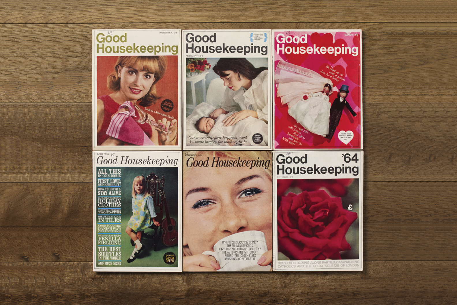
The rest of the collection was of general interest but not notable for its design, with one exception. It was with great surprise then that I opened the box of Good Housekeeping magazines from the mid-60s.
Good Housekeeping is a title of remarkable longevity. The American imprint was launched in 1885 and is still going strong today. By contrast the British edition, which I had chanced upon, was a mere stripling, dating back to 1922. What I was looking at here then, was a 40-year-old title in the process of reinventing itself for the new decade.
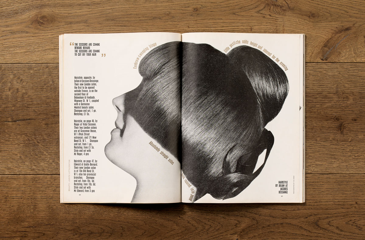
“By far the most interesting issues were those designed by Jack Larkin. Under his stewardship, Good Housekeeping mixed some of the playful pop sensibility of Nova with a rigorous modernist austerity.”
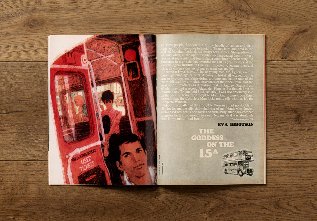
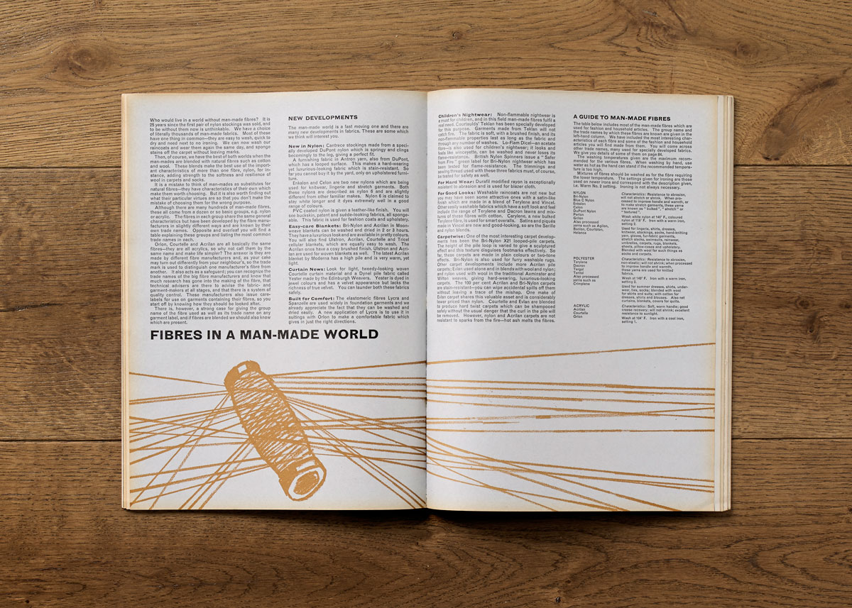
A cursory glance revealed several art directors working over the period, but by far the most interesting issues were those designed by Jack Larkin. Under his stewardship, Good Housekeeping mixed some of the playful pop sensibility of Nova with a rigorous modernist austerity.
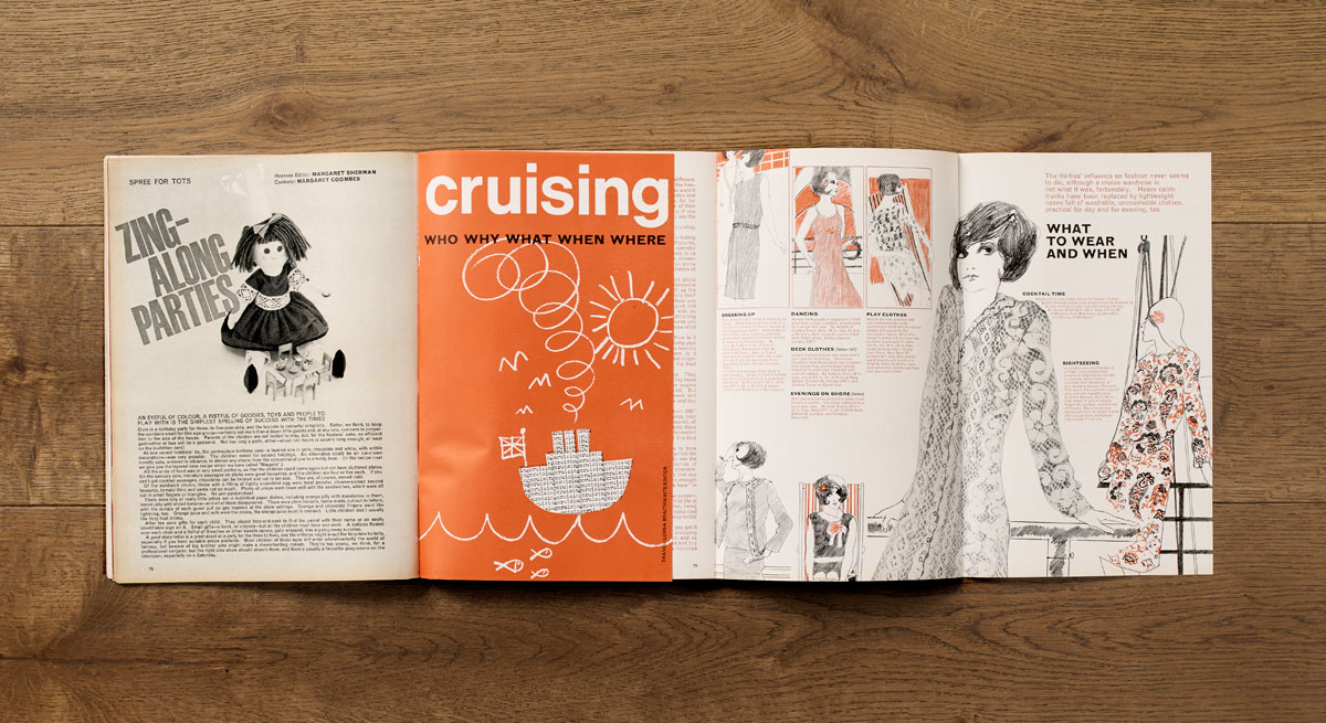
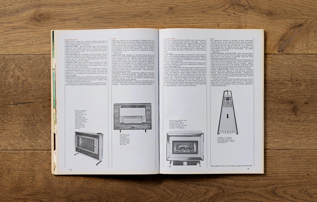
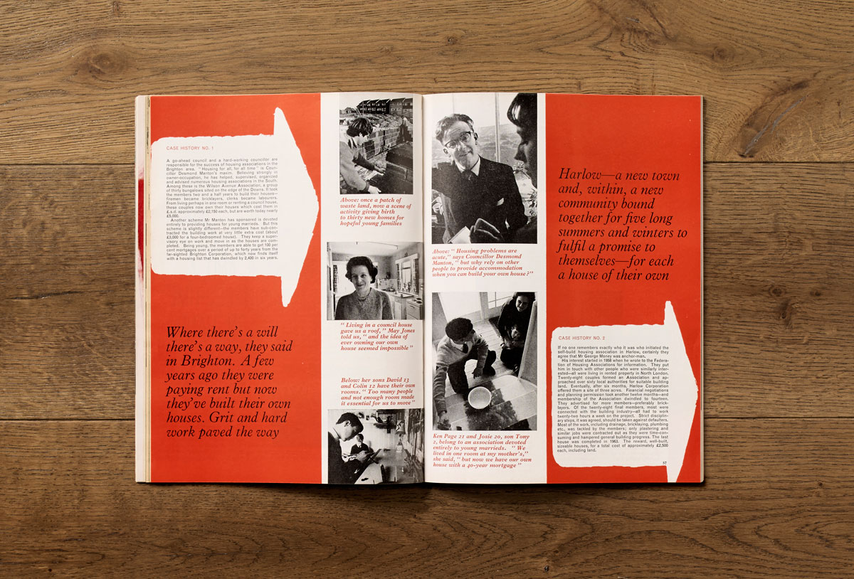
The centre pages were taken up with the Good Housekeeping Report; an authoritative section printed on uncoated stock using black and white still-life photography and spot-colour illustration.
Illustration is used extensively throughout the title, as are numerous printing and finishing techniques: overprinting, throwouts and spot colours are all in evidence.
I have been able to find very little out about Jack Larkin though. He was an Australian graphic designer working in London in the early 60s. He was noted at the time for his book cover work, and was the subject of a recent post by designer Mike Dempsey on his Graphic Journey Blog, who called him ‘one of the great lost designers’.
Jack returned to Australia in the 1970s, where he became head of the Graphic Design department at Monash University in Melbourne. A post which he held into the 1980s.
I think it’s no judgment on Larkin that he has been forgotten – his work would stand on its merits at any time. It’s more likely a case that he was practising at an especially fruitful period for graphic design; a time during which some people will inevitably fall into obscurity.
It’s a testament to the fluidity, boldness and experimentalism of visual culture in the 1960s that Larkin can have been allowed to produce work like this for what was presumably a conservative, suburban, middle-aged readership. With only two, black and white, television stations on air and no colour supplements, it was through magazines like this that much of the country would have experienced the ‘swinging sixties’. Though he may now be a ‘lost designer’, Jack Larkin was perhaps more influential than he ever realised.
First published in Creative Review. All images: PSC Photography. Paul Pensom is the Creative Director of StudioPensom and Art Director of Creative Review.